
Everything is always more complicated than you think, COVID edition
One of the big economic and social stories of the past year is that for the first time since WWII the UK’s population is shrinking.
I did a report for Sky News about this earlier on this year, a film of which you can see below, but the gist is broadly as follows: due to Covid (and to a probably lesser extent Brexit), a lot of young foreign workers left the country and returned home. At the same time, the natural population - in other words births minus deaths, also dropped into negative territory in 2020 because more people died than in most years and fewer people had babies than usual.
Now, this fall is almost certainly temporary, but it has some pretty important consequences. I referred to a few of them in the report: if there’s fewer people around that means the economy generates less income and spending and therefore gross domestic product (which is simply the sum total of either income or spending) will probably be lower. If the population stays low, we can also expect more labour shortages in the coming years.
But there’s another more nerdy consequence which, it turns out, might actually be quite consequential. Because the upshot of all of the above is that our picture of how many people there are in the country is far more uncertain than usual. And that matters when it comes to assessing Covid and the efficacy of the vaccination programme, because the estimate of what proportion of people is vaccinated depends, in turn, on the number of people here in the country. We know how many people have been vaccinated - just under 44 million with two doses as of the latest data - but we are slightly less clear about the other number: how many haven’t been.
All of which is a long-winded way of saying: it’s worth being especially cautious about any population-wide figures about the virus and the vaccines. Take this chart based on a dataset produced in a Public Health England report last week.
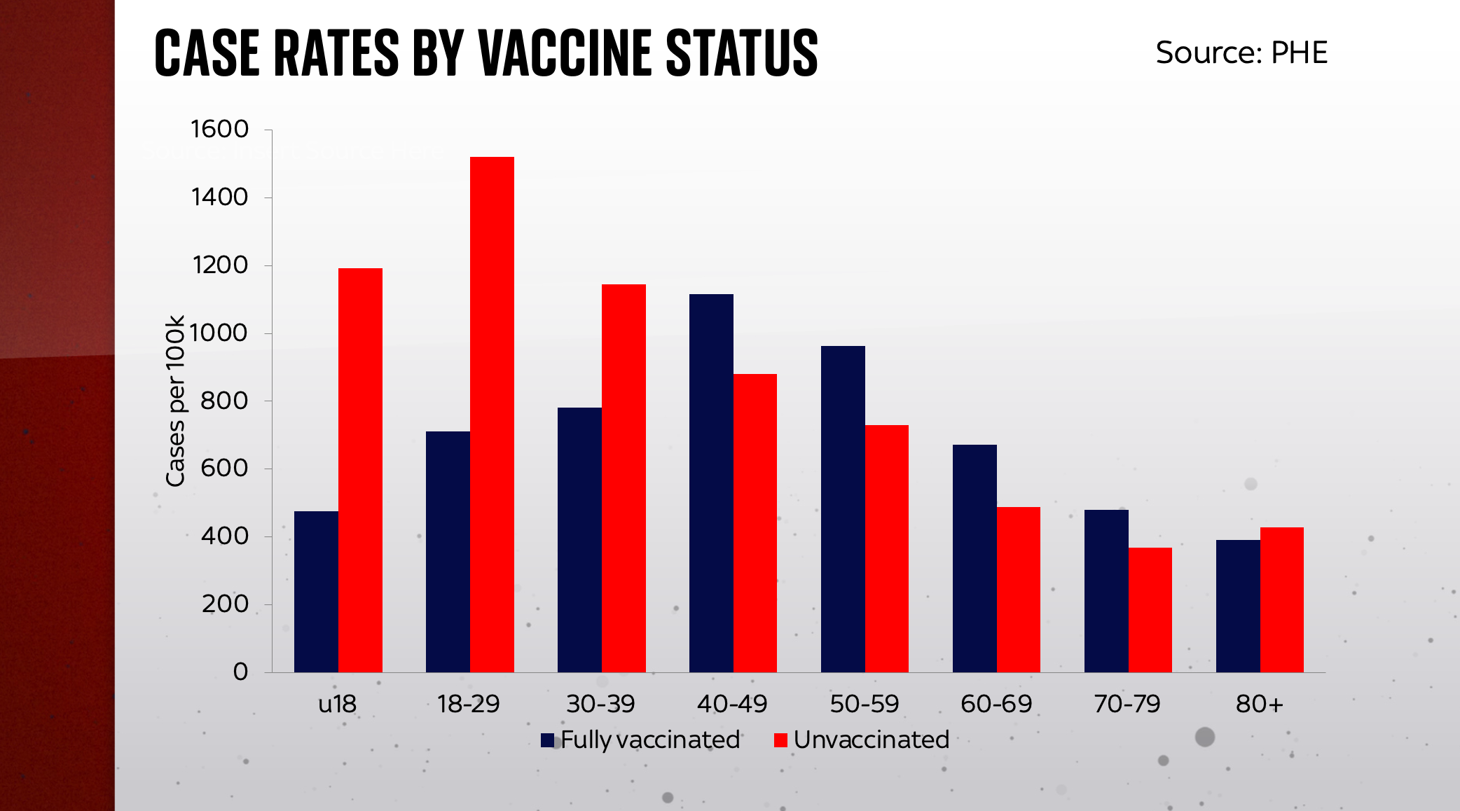
The dark blue bars on the chart show vaccinated people; the red bars are unvaccinated people (which, to be absolutely clear, means people who have had no doses). The higher the bars are, the more of those people - per 100,000 of that population group - got COVID-19. And you can see something striking: for those aged over 40 there are more fully-vaccinated people getting Covid. It seems to imply they are more susceptible to the virus, not less.
This has led to some seriously panicked reporting in recent days, and perhaps that’s no surprise. After all, we were told that the vaccines would offer at least some protection from contracting the virus. Not 100%, for sure, but not zero percent and surely not a negative number?!
But as James Ward explains in this thread, those bars above are just as dependent on guesses about the size of the population (the PHE dataset uses something called NIMS) as they are on the actual numbers of vaccinated individuals.
There are some real reasons why we might expect vaccine effectiveness to have declined – including the impact of delta, and waning of immunity over time. But there are also a number of potential confounders and distortions here, including:
— James Ward (@JamesWard73) September 9, 2021
So, for instance, if you take the same data used by Public Health England and use a different estimate of the population size, for instance the ONS’s latest population estimates, you get a different picture.
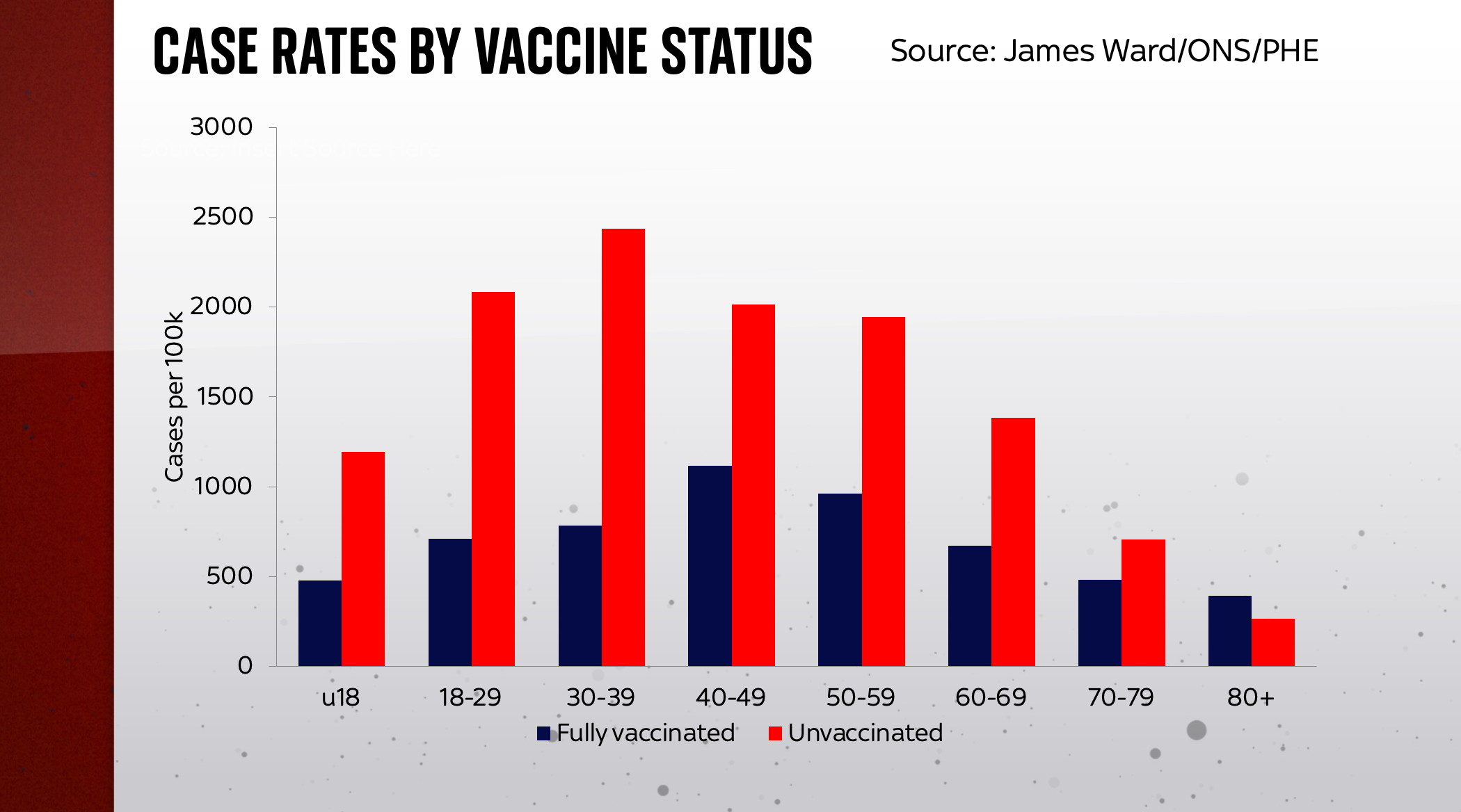
Now it seems as if in all age groups save for the over 80s, those who have been fully vaccinated are not catching the virus as much as those who are not vaccinated at all. This seems to be more consistent with what we know from the vaccine trial numbers, but is it any closer to the “reality”? Perhaps but, frankly, it’s really, really hard to be sure. And now bear in mind that neither of these different population measures has fully adjusted for the fall in the population in the past year - a fall which could have a serious bearing on these numbers...
We are, in short, quite deep in the dark here. Most studies suggest the vaccines are pretty effective at preventing infection - albeit significantly less so against the Delta variant and significantly less so than natural immunity from previous infection (at least so it seems from the early studies). But there’s a lot of doubt here, which raises another question: given what we know (or rather what we know we don’t know), what bearing does this have for policies like vaccine passports (now put on ice in England but not in Scotland)? The main point of such schemes is that vaccines endow people with immunity which means they are somewhat less likely to infect other people in, say, your nightclub or indeed your country.
But if you were basing your public health response purely on what the data/research is telling us, then wouldn't this real-world data on vaccine breakthroughs give you pause for thought? If you were basing it on the latest studies and wanted such a scheme then shouldn't you be giving people passports not just on the basis of whether they’ve been vaccinated but also whether they have natural immunity from previous infection? After all, academic research suggests that people who have already had and recovered from Covid will be safer to have in your nightclub than those who are vaccinated. Yet here in this country (though not, interestingly, the EU), natural immunity is regarded, at least within the complex of travel rules, as inferior to vaccination status.
Now, one can understand the pitfalls here. Public health officials generally don't like the idea of incentivising people to get sick, which is a possible perverse side-effect of having an antibody passport (as opposed to a vaccine passport). Then again, in the early weeks of the pandemic, getting young people infected was reportedly precisely what the government wanted to do.
Anyway, protection from immunity, important as it is, is not the only dimension through which we should be assessing the vaccines. They are also supposed to protect anyone who has had them from hospitalisation and death. How are the numbers looking on that front? The short answer is: a lot clearer, as you’ll see from the following chart.
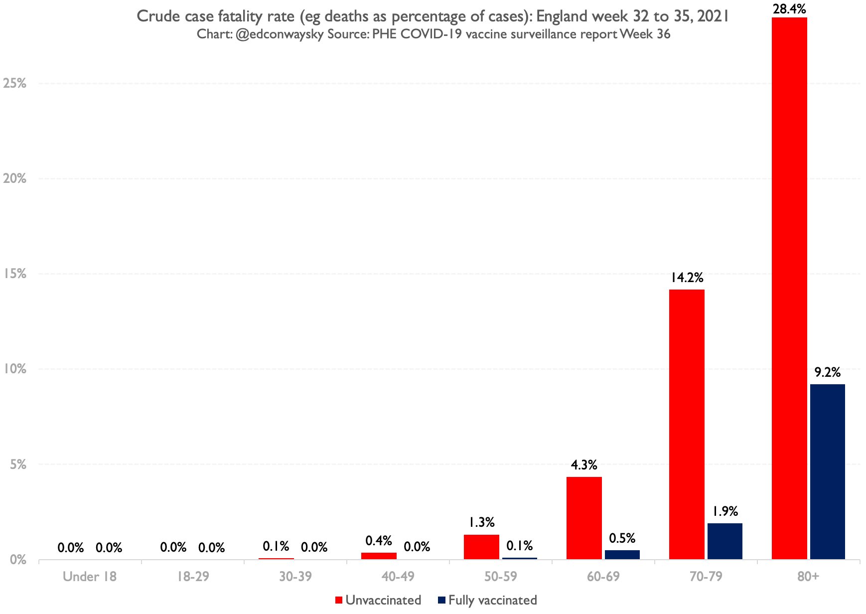
The bars in this chart show you the proportion of Covid cases which then sadly go on to die. The higher the bars, the bigger the proportion of those cases are turning into deaths. Again, the red bars represent unvaccinated people, the dark blue bars are vaccinated people. And you can probably spot a couple of things. First, all those dark blue bars are considerably lower than the red bars - in other words the percentage of vaccinated people who go on to die is much lower. In the case of those in their 70s, for instance, 14% of unvaccinated cases died, compared with 1.9% of vaccinated cases. That's a massive difference. Here is the same data on a logarithmic axis:
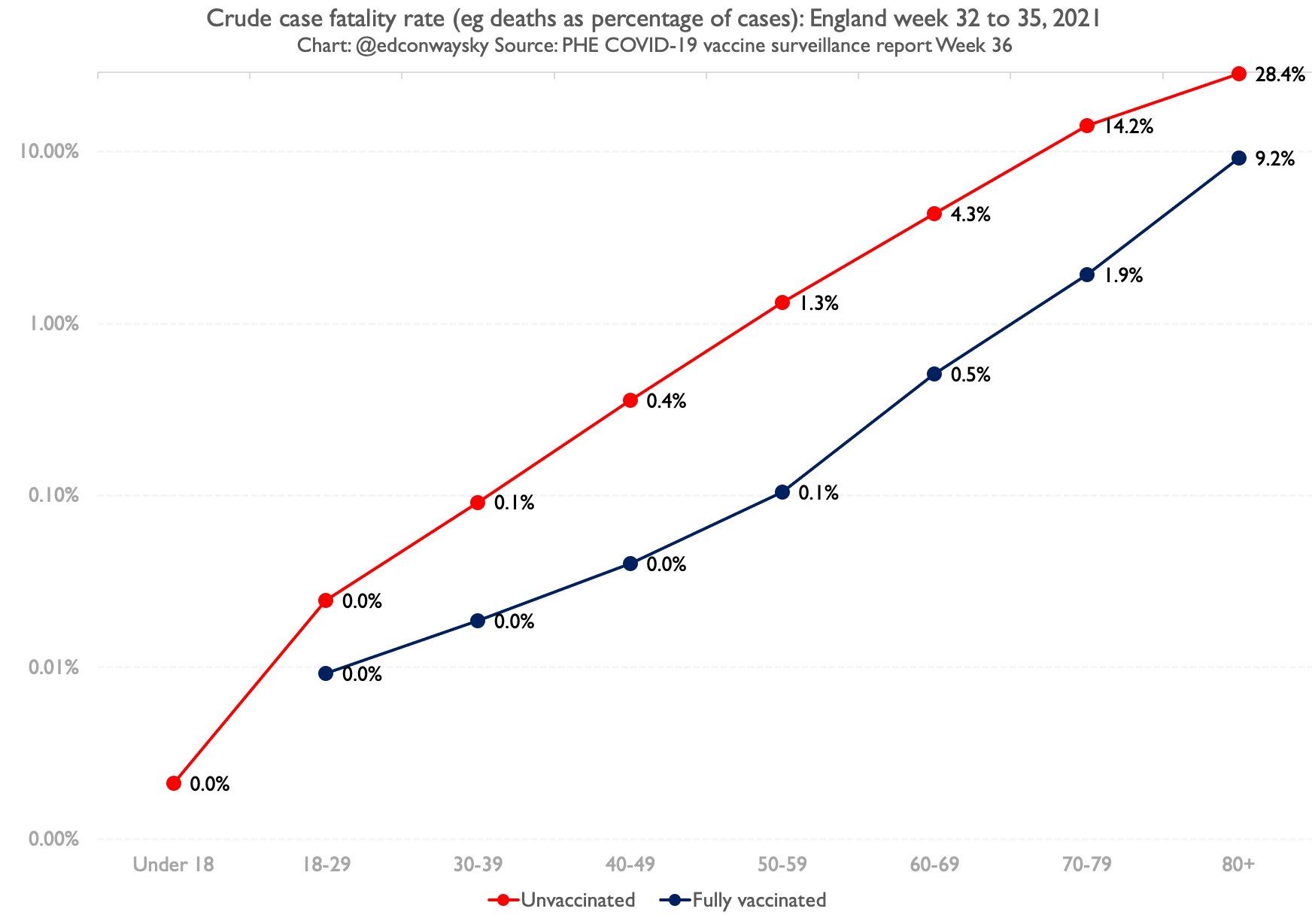
Even here, though, there are still question marks. In much the same way as we couldn’t entirely rely on the population numbers when it came to those case rates, can we really rely on the case numbers here? Well no, not entirely, since there are reasons to believe they might understate the number of cases, especially for those who are vaccinated, who seem (anecdotally) less likely to get tested than those who aren’t. Plus the deaths here refer to the same period as the cases; in an ideal world you’d want to look at deaths two or three weeks after the case numbers (though on the flip side it’s not altogether clear that would make an enormous difference this time around given case levels have actually been relatively flat in the past month or so).
But you’ve probably noticed the other pattern in that chart: mortality - for both vaccinated and unvaccinated - drops very quickly the younger you get. Indeed, by the time you get down to those in their 30s there’s very little difference in mortality outcomes between those who are vaccinated and those who aren’t. By the time you get down to people in their 20s and those in their teens, the difference is less than a rounding error (to be specific, it’s 0.002% of unvaccinated under 18s who caught Covid and died vs 0.000% of vaccinated).
Now, mortality is not the only consequence of getting Covid; it is an unpleasant experience and, for some, can result in long Covid. By the same token, the vaccines can also have serious side-effects; like it or not, no medication is 100% safe. So this isn’t the only prism through which to view the trade-offs.
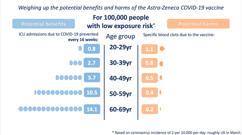
Probably the best way of visualising those trade-offs was the chart above produced by the Winton Centre at Cambridge when the MHRA decided against giving the AstraZeneca vaccine to those under 40. It remains the most useful illustration that I've encountered of the benefits vs the harms, but it remains incomplete: the risk profile of the virus has changed since Delta came along and, by the same token, we ought to know a lot more about side-effects. Why hasn't the MHRA updated it since?
But that's somewhat by the by. The overarching point from the data above is that the vaccines do indeed reduce the mortality risk considerably for older people. We know this now from our experience, not just from drug trial results. That is great news.
Of course, vaccination isn't just about individual risk: it's also about attempting to confer herd immunity on the population. If the vaccines were 100% effective at preventing people from catching Covid and had no side-effects, this would be a slam dunk. It would make sense to vaccinate all age groups, if only to prevent the disease spreading. Covid could be brought to a rapid end - hurrah!
But they're not 100% effective. And the individual risk-benefit calculation for the younger age groups is very finely balanced indeed, especially given that these drugs - for all that they have been tested extensively - are still relatively new.
Put it all together - question marks about immunity against infection, individual risk-benefit trade-offs, the disruption to children's education from the virus - and you can see why the decision to vaccinate gets trickier the further you go down the age spectrum.


Comments ()