
We need more maps

Were it not for a mapping error, or rather a series of them, Christopher Columbus might never have sailed for America.
When he set out across the Atlantic in 1492, the Italian explorer did so confident in the understanding that provided he headed in a roughly straight line westwards from the Canary Islands, he would hit Japan in about 4,300km - a manageable distance. How did he know this? Because he believed he had some of the very best cartographic intelligence of the time.
Columbus was, at least in his early years, a mapmaker himself. We don’t know precisely which maps he consulted before making his journey but we do know the state of mapping at the time, and the state of mapping was, to be frank, somewhat primitive. The great maps of the era - those drawn by Henricus Martellus or the world’s first globe, made by Martin Behaim the same year Columbus departed - were mostly based on calculations laid down more than a thousand years earlier.

Claudius Ptolemy, who died around the year 170, was the great cartographer of the ancient era. His calculations about the dimensions of the known world were still being used well into the Renaissance. By modern standards his maps are exceedingly primitive. Even leaving aside the absence of vast tracts of undiscovered land, the known world was also weirdly depicted. The “boot” of Italy is unduly squashed while northern European countries like Britain are oddly thin. In Ptolemaic maps Sri Lanka is utterly enormous - bigger even than India; Eurasia is also too big, occupying most of the map.
Still: given how much the world had been explored at the time, it is a testament to this Roman-Egyptian polymath (or perhaps even more so an indictment of the dark ages that came after him) that his maps were not to be bettered for more than a millennium. A thousand years later mapmakers were still working on Ptolemaic projections as they sketched the beautiful early maps of the world. They reflected recent explorers’ discoveries, but they also added unsubstantiated flourishes.
One of my prized possessions is an old Ptolemaic map of the world with the winds depicted, north to south, as cherubs blowing ships around the seas. There are monsters in the oceans and strange islands dotted around the place. Medieval mapmakers had an aversion to blank space, so filled the oceans with imaginary islands.
Contrary to the conventional wisdom, Columbus was not alone in believing the world to be round; most educated people knew in 1491 that earth was not flat. Most people understood that if one sailed long enough in one direction you would eventually circumnavigate it. The real question was not the shape of the world but its size.
Columbus’s maps were catastrophically wrong - his estimate of the size of the planet out by some multiples. The distance between Spain and Asia is not 4,300km but 15,000km. He had overestimated the size of Eurasia - like Ptolemy before him. He assumed Japan was significantly bigger than it really was (at the time no-one quite knew the dimensions of Japan, so what existed was mostly educated guesswork based on comments from Marco Polo). According to John Noble Wilford, whose book The Mapmakers is perhaps the definitive popular history of cartography, Columbus had also underestimated the length of a degree of longitude, further shrinking the estimated voyage.
We all know what happened next; he set out and landed in the Caribbean. He thought he was in Japan - that was what his charts suggested. But no matter; he drew maps of the new lands, sent them back home and became a household name.
In hindsight, had Columbus’s plans been more accurate it is unlikely he would ever have raised the funds for his voyage. Crews could only survive so long on the open seas. Kings and queens would only finance voyages which had a reasonable chance of success. Before Ferdinand and Isabella said yes, the King of Portugal had said no, seemingly because he was skeptical about Columbus’s sums.
All of which is a very long-winded way of underlining that the 15th century exploratory economy depended in large part on data. But that data that came in the form of maps. In much the same way as start-ups raise money these days via a slide-deck and a great pitch, Columbus’s campaign to find a westward route to the Indes (remember, he was hoping to reach Asia, not to discover America) was prosecuted via maps.
Long before William Playfair invented the bar chart or the pie chart, the most important charts in the world were those that mapped the world. Sea charts that depicted the oceans and coastlines; geological maps that showed where to find certain rocks and metals. Maps of territories and of trade. Maps were what helped us understand the world in those first eras of globalisation - from Columbus to the Great Game. The progress of humanity was evident not just in its inventions and its standard of life, but in the accuracy and complexity of each new generation’s maps.
These days, however, when it comes to data visualisation, maps rarely get a look-in. One reason for this is that all too often we use data not to dive deeper into issues but to simplify them. Consider this chart.

This is a familiar statistic - gross domestic product - depicted in an unfamiliar way. The orange lines represent every one of the 90-odd sectors of the UK economy, showing their comparative performance since 1990. There are (as you would expect) some extraordinary divergences. That line at the very top is IT and Communications, whose economic output has increased more than tenfold since 1990. What might not be so obvious is that other lines are down very sharply: mining and quarrying, for instance, is barely a quarter of its 1990 output.
My point, however, is that when we talk about GDP we focus not on the tangle of lines above but on the black line in the middle: overall gross domestic product. This is fair enough: macroeconomics is about the aggregate numbers. However by focusing on a single line, we lose sight of the complexity beneath it.

Which brings me to a question: when was the last time you looked at a map? I mean a real map, not a GPS app telling you how to get from A to B. When you scan a map what you see is a depiction of complexity: of how countries (or in some cases organisations or areas) are spatially arranged. You might see the interrelationships; you might get a sense of how the minute parts fit into the big picture. You have macro and micro arrayed before you. When you look at a line chart of an economic statistic these days, you invariably get just that: a line.
The point I’m driving at isn’t just about statistics. It’s about how we perceive the world. These days policymakers describe the world via charts - of GDP, of inflation and so on. They do far less thinking about how the component parts of the global economy fit together. They don’t think in terms of maps.
To some extent this is simply a reflection of economic norms. Following the collapse of the Soviet Union - and what that said about the pros and cons of central planning - most governments around the world abandoned the notion that they had any chance of managing something as complex as a national economy. So they left the monitoring and management of supply chains to those who actually work in them - the private sector. This makes plenty of sense. But the upshot was that in recent years the government has lacked a map of how the economy fits together.

Consider one of the big stories of the era: the energy crisis and its unexpected consequences. A constellation of factors - everything from high LNG demand to low Chinese coal output - has pushed up global energy prices. That in turn forced fertiliser companies to shut down their plants (the Haber Bosch process is very energy-intensive). But alongside fertilisers, those plants also produce 60% of the UK’s pure carbon dioxide, which in turn is essential to all sorts of sectors, including agriculture, which uses it to stun pigs and other animals ahead of their slaughter. This is the chaos effect of the 21st century economy - where a butterfly flap on one side of the globe can cause a hurricane, or rather a potential bacon shortage, on the other side.
The striking thing about the (very, very simplified) flow chart above is how few people, both in government and in the supply chain itself, understood these risks before they materialised. A few wise companies had created their own CO2 production, but most were totally unprepared and totally unaware. The supply chain could not look after itself. Equally tellingly, the crisis came as a complete surprise to the government, which has now had to bail out the fertiliser sector. It is unlikely to be the last such bail-out.
Because a problem in one of these links can very quickly spread to other parts of the economy. Consider: Chinese coal mine shut downs don’t just affect the fertiliser industry. They also affect the semiconductor industry. Here’s why.

Read the flow chart from right to left. If you want to make a computer chip, you don’t just need lots of capacity at your fabrication plant in Taiwan or South Korea or elsewhere; you need a silicon wafer onto which you’ll imprint your transistors (you also need lots and lots of chemicals but that’s a story for another day). If you want silicon wafers you need polysilicon, an incredibly pure version of silicon, produced via an extraordinary chemical process called the Siemens Process. The main ingredient for polysilicon is metallurgical silicon, and if you want that you need not just quartzite (the silicon) but coking coal.
In other words, anything happening in the coal market isn’t just of consequence for the energy market; it matters for the production of silicon chips (and, for that matter, solar panels, since most silicon metal goes into photovoltaic cells).
And guess what: the tail is already wagging the dog. When the cognoscenti talk about the semiconductor shortage they tend to talk about the very right hand node on this flow diagram - the chip factory itself. They talk about capacity, about skills, about Taiwan-China politics and about the travails of Intel. But they rarely go deeper into the supply chain. They rarely look at silicon wafers, still less at silicon metal and how on earth that is made. But they should. Because if they did they would encounter charts like this one.
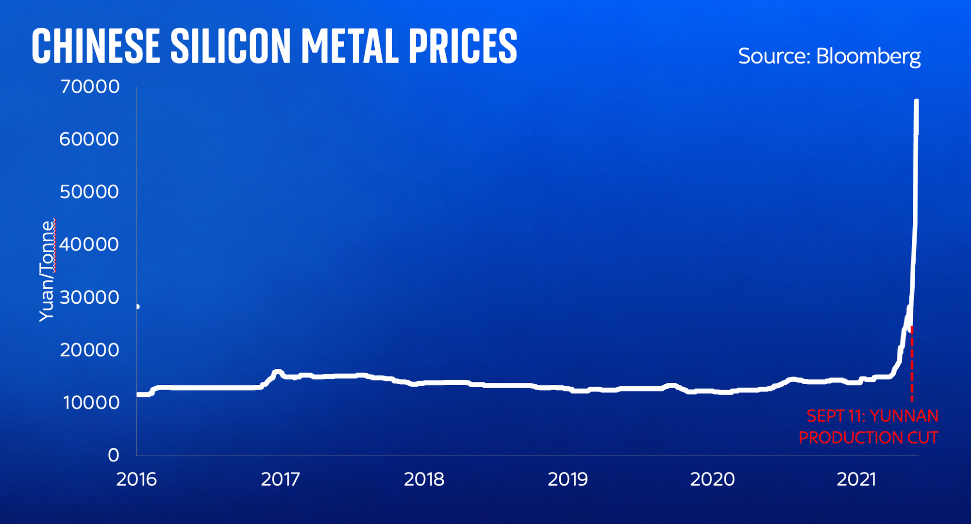
This chart shows you silicon metal prices in China, and just look at what has happened to them in the past month - a consequence of a 90% production shutdown in Yunnan Province in China, which in turn is primarily down to a shortage of coal.
I have spent many months getting my head round the semiconductor supply chain - all the way from the bottom to the top - in the process of writing a book. It is truly fascinating and utterly mind-expanding. But what has most struck me as I’ve delved deeper is just how few people are aware of how each part fits into the next one. I’ve spoken to chip executives who don’t know what silicon wafers are made out of, and to those at the bottom end of the chain totally oblivious of where their silicon eventually goes. Few executives at giant silicon fabs spend much time thinking about quartzite availability or the impact of coking coal or wood chips on their processes. Yet as we are about to find out (back to that chart above), these unexpected cascades are not going away.
The flow charts above are about as primitive a set of maps as you could imagine for these complex systems. But they are a start. And spending time contemplating these process has left me wondering whether anyone is building the maps we need to understand how the global economy fits together. There are private sector intelligence firms working on this. But little of this stuff finds it way into the public sphere. And that’s a problem.
Because without decent maps about how the global economy works - about which input from which company or process or country feeds along a supply chain - we are doomed to perpetual supply shocks such as the ones we’ve experienced in recent months.
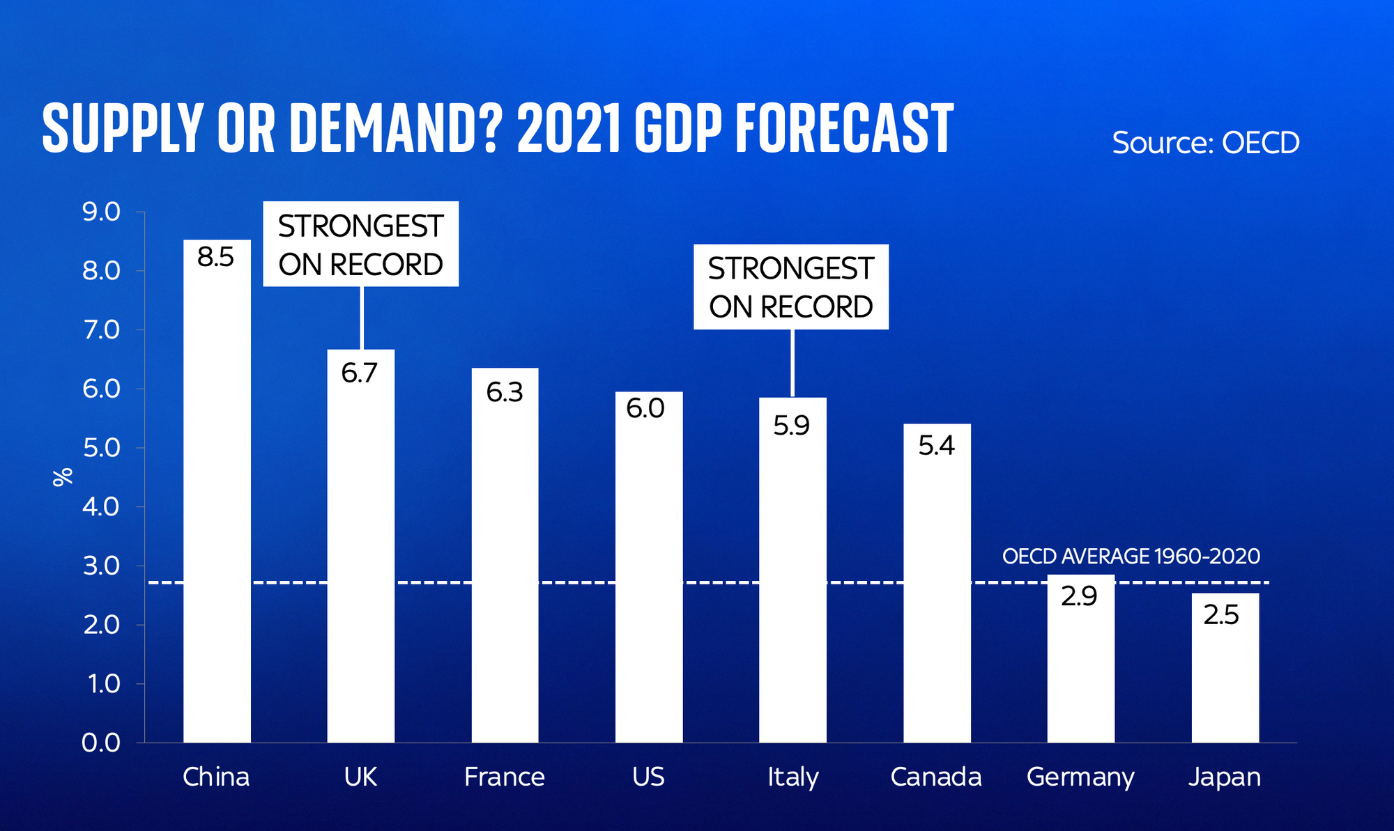
Now it’s certainly true that this is an especially intense period of strain for supply chains, for a few intertwined reasons. The world economy is growing at a rate which, frankly, we have never seen before. Yes, this is a post-Covid bounce, but even so. The global system, such as it is, simply isn’t geared up for 6% plus growth. If the machine is overloaded, that shouldn’t be a surprise. That we are facing this demand shock at the same time as an energy transition, in which we’re attempting to shift the world from energy-dense but pollutive fossil fuels onto less energy-dense and more intermittent renewable sources of power, only adds to the strain. That all of this coincides with a set of trade adjustments - the US fighting a trade war with China, the UK leaving the European Union - only adds to the strain.
In other words, it’s hard to imagine how any economy could avoid supply shortages in these circumstances. It’s hard to imagine how the above couldn’t be enormously inflationary - if only temporarily. But if only we had better maps about how the world economy worked, even if only primitive ones like the flow charts above, we might at least be a little better prepared for what we’re facing.
Because while a single year’s gross domestic product print might come and go, the energy transition is something we’re all going to be experiencing, one way or another, for the rest of our lifetimes. And our understanding of these supply chains - both inside government and out - is astonishingly shallow. Our understanding of what it will take - the engineering and economic and logistic challenge - to get to net zero is depressingly vague.
Back in the 1930s, in the face of a Great Depression, economists concluded that the world needed a new suite of statistics to help them understand the world. The result was gross domestic product and national accounts. Today, as the world faces a supply crisis that could tip millions into fuel poverty and obstruct the economic recovery, perhaps it’s time we had a similar conversation.
For centuries, our policymakers pondered maps to help them understand the world. In the 15th century maps helped Columbus make his case to sail the ocean blue (even if he got his sums wrong). In the 19th century a map drawn by William Smith helped identify the most promising geological sites in Britain for coal and iron mines. It is time for new maps, New maps to help us understand the complex, intertwined, intriguing economic world we live in.
By the way... this blog was partly based on a talk I gave at the Sky News Big Ideas Live event this week. You can watch the full thing, which also includes all sorts of random dives into things like the labour market, wages, and the story of the Industrial Revolution, in the video below.


Comments ()